Photo Greeting Card Design Mistakes You Don't Know You're Making
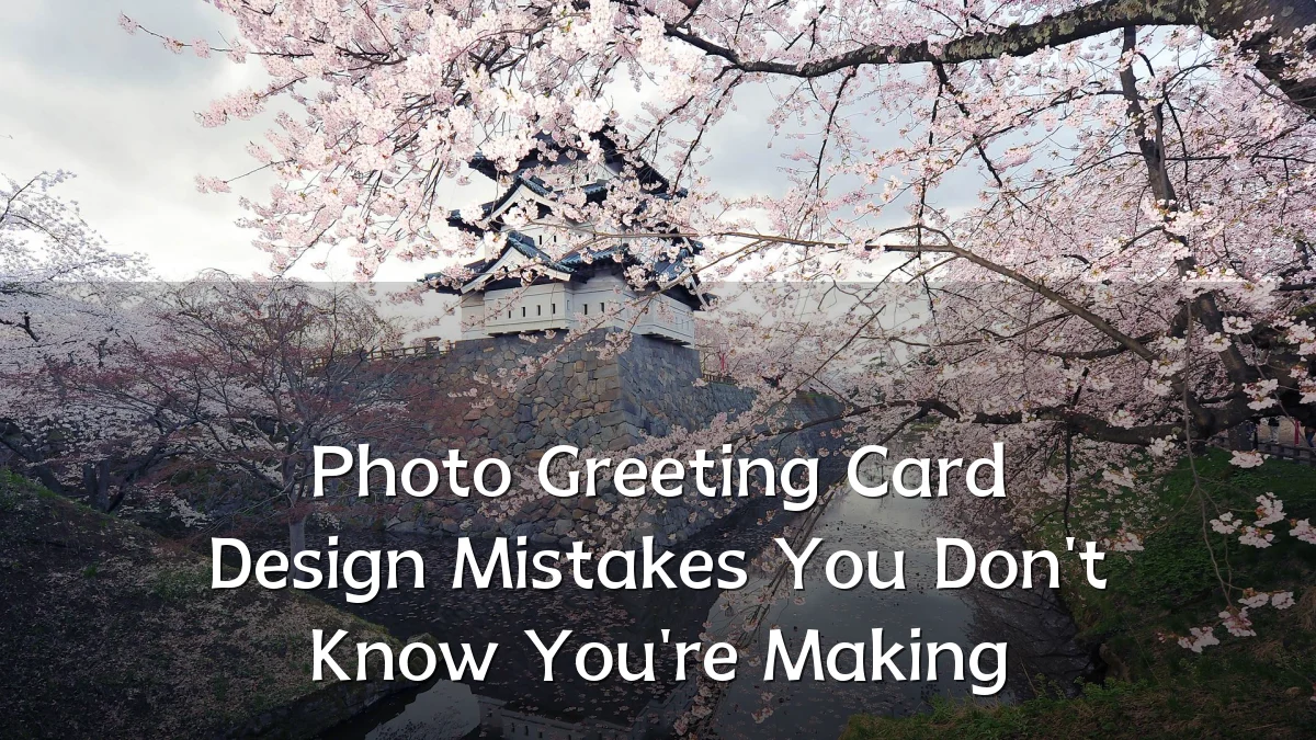
Photo greeting cards remain a staple for personal milestones, holiday outreach, and small-business client appreciation. Yet even experienced senders routinely produce cards that miss the mark—not because of poor photography, but because of subtle design choices. As digital printing and online editors make customization easier than ever, the gap between a card that merely features a photo and one that communicates clearly is widening.
Recent Trends in Photo Greeting Cards
The shift from traditional printed stationery to online design tools has changed how people approach photo cards. Current patterns show a move toward minimalist layouts, larger image blocks, and integrated photo collages. At the same time, printing services now offer a broader range of finishes, paper stocks, and envelope options, which introduces new variables that can quietly undermine a design.
Another trend is the increased use of photo cards for non-holiday occasions: thank-you notes, save-the-dates, birth announcements, and year-in-review mailers. Each occasion carries different visual expectations, yet many users apply the same template logic to every event.
Background: Why Design Errors Persist
Most photo card mistakes are not caused by carelessness. They stem from the editing interface itself. Online tools encourage users to fill every available space, auto-center text, and rely on default color overlays. These defaults often clash with the underlying photograph, producing cards that look "almost right" but fail at a functional level.

Another underlying factor is that people evaluate their card design on a computer monitor, not in print. Screen brightness, color calibration, and viewing distance all differ from the printed result. A design that looks balanced on a laptop can appear cramped, too dark, or poorly cropped once printed at a standard 5x7 or 4x6 size.
User Concerns and Common Mistakes
The most frequent complaints from recipients are not about photo quality. They are about legibility, coherence, and emotional tone. Designers and frequent senders have identified several recurring issues that most people do not recognize until the cards arrive.
- Placing text over busy image areas. Even with a semi-transparent overlay, names and dates become difficult to read when layered over patterned clothing, foliage, or detailed backgrounds.
- Ignoring the safe-print margins. Online previews often crop edges differently than the final print. Text or faces placed near the border can be cut off or feel visually trapped.
- Using a single photo when two would tell the story. A portrait of one child or one family member can unintentionally exclude others or flatten a memorable moment into a static pose.
- Overusing decorative fonts. Script-type styles may look elegant at a glance but reduce readability at card size, especially for addresses or event dates.
- Forgetting the back panel. Many cards are designed with attention only to the front, leaving the back plain or cluttered with a small, unbranded message. This is a missed opportunity for a personal note or a cohesive closing line.
- Matching colors to the photo, not the paper. White text on a pale sky or dark text on a dark background often looks intentional on screen but fails against the printed card's natural white or cream base.
Likely Impact of These Mistakes
The consequences are rarely dramatic, but they are consistent. Recipients may pause a moment longer than necessary to parse a message, or they may not read the card at all. For personal milestones, the result is a mild disappointment. For business senders, the impact is more tangible: a card that feels unpolished can subtly weaken trust in a brand, even if the recipient does not consciously identify why.
Printing costs also multiply the effect. A typo, a misaligned border, or an unreadable date becomes an expensive error once a full batch is printed. Unlike digital content, a photo card cannot be edited after it is mailed. This permanence makes design verification a practical necessity, not just an aesthetic preference.
Beyond individual cards, recurring mistakes contribute to a broader fatigue with photo cards. When many cards from different senders begin to look alike—same fonts, same layouts, same cropping habits—recipients are less likely to pause and engage with any of them.
What to Watch Next
Look for card-building platforms to introduce more intelligent layout tools in the near term. Features such as automatic safe-area indicators, contrast checks between text and image, and AI-assisted crop suggestions are emerging as differentiators among online printing services. These tools may reduce the learning curve, but they will not eliminate the need for user judgment.
Also watch for a gradual shift toward smaller photo cards and flat cards, which require different spacing rules than traditional folded formats. As sustainability concerns grow, some providers are promoting thinner paper stocks and lighter envelopes, which can alter how colors appear in print.
Finally, expect more guidance from designers and stationery experts about treating the photo card as a single visual system—front, inside, and back—rather than a photo with a caption. The senders who adopt that mindset will likely produce cards that feel more intentional, regardless of template trends.